之前的主页是参考别的Html5的单页面模板:
去修改而得到的:
现在需要在里面添加 产品介绍
类似于:
所以要去找到对应的有这种内容的模板,再去参考
去找找,可以用得上的:
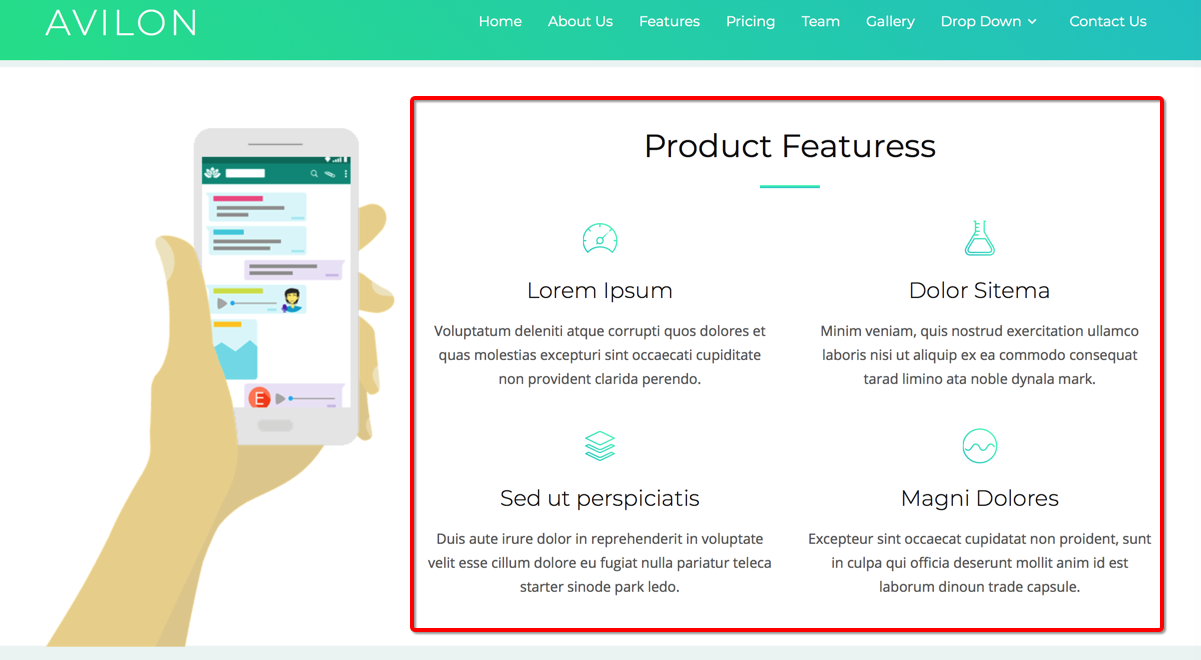
https://onepagelove.com/avilon
-》
https://demos.onepagelove.com/html/avilon/
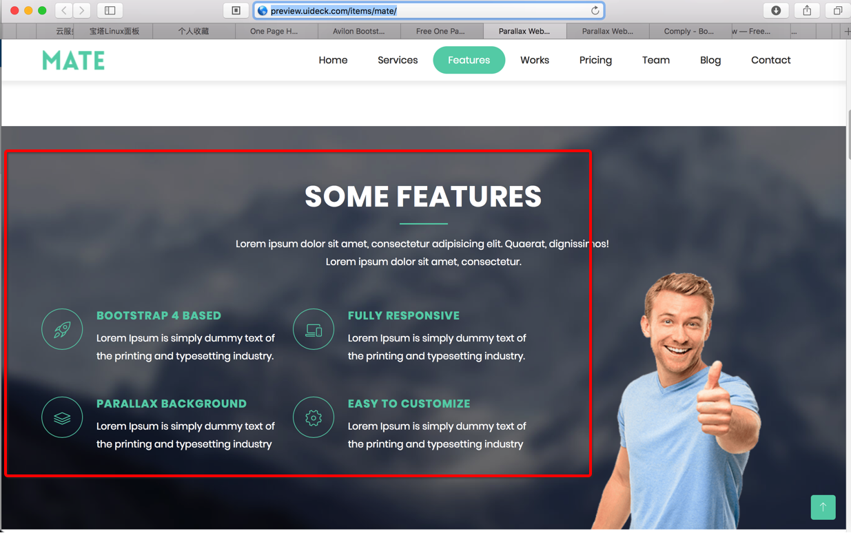
自己正在用的就是这个:
http://preview.uideck.com/items/mate/
中的:
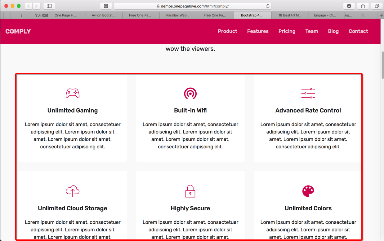
https://onepagelove.com/comply
-》
https://demos.onepagelove.com/html/comply/
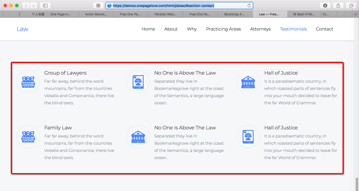
https://demos.onepagelove.com/html/pblaw/#section-contact
最后是,参考了:
https://demos.onepagelove.com/html/avilon/
https://demos.onepagelove.com/html/comply/
用代码:
html:
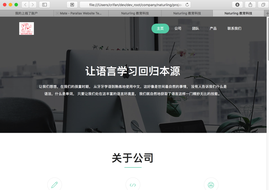
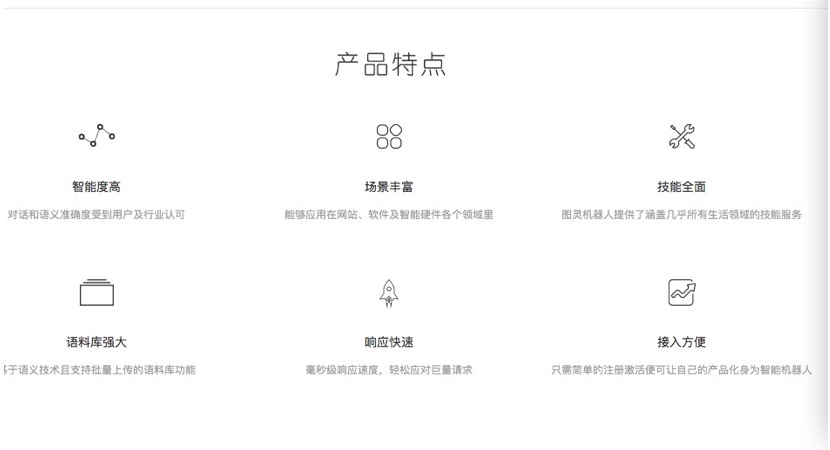
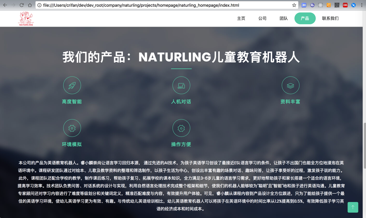
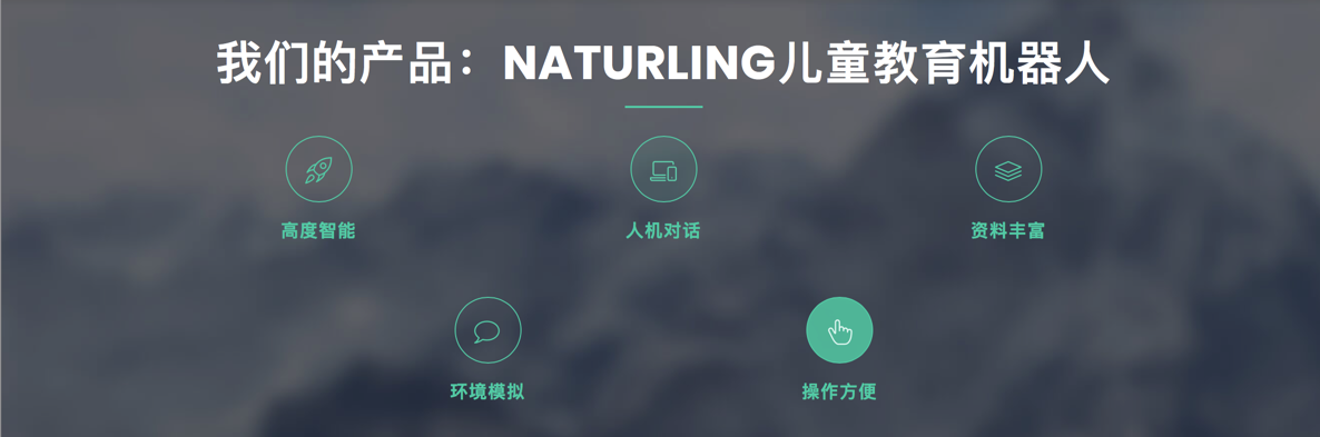
<code> <!-- Product Section --> <section id="product" class="section"> <!-- Container Starts --> <div class="container"> <div class="section-header"> <h2 class="section-title">我们的产品:NaturLing儿童教育机器人</h2> <hr class="lines"> <div class="row"> <div class="col-lg-12 col-md-12 col-xs-12"> <div class="container"> <div class="row"> <div class="col-lg-4 col-sm-4 col-xs-12 box-item"> <span class="icon"> <i class="lnr lnr-rocket"></i> </span> <div class="text"> <h4>高度智能</h4> </div> </div> <div class="col-lg-4 col-sm-4 col-xs-12 box-item"> <span class="icon"> <i class="lnr lnr-laptop-phone"></i> </span> <div class="text"> <h4>人机对话</h4> </div> </div> <div class="col-lg-4 col-sm-4 col-xs-12 box-item"> <span class="icon"> <i class="lnr lnr-layers"></i> </span> <div class="text"> <h4>资料丰富</h4> </div> </div> <div class="col-lg-4 col-sm-4 col-xs-12 box-item"> <span class="icon"> <i class="lnr lnr-cog"></i> </span> <div class="text"> <h4>环境模拟</h4> </div> </div> <div class="col-lg-4 col-sm-4 col-xs-12 box-item"> <span class="icon"> <i class="lnr lnr-cog"></i> </span> <div class="text"> <h4>操作方便</h4> </div> </div> </div> </div> </div> <!-- <div class="col-lg-4 col-xs-12"> <div class="show-box"> <img class="img-fulid" src="img/features/feature.png" alt=""> </div> </div> --> </div> <p class="section-subtitle">本公司的产品为英语教育机器人。睿小麟崇尚让语言学习回归本源, 通过先进的AI技术,为孩子英语学习创设了最接近ESL语言学习的条件,让孩子不出国门也能全方位地浸泡在英语环境中。课程研发团队通过对绘本、儿歌及教学资料的整理和筛选制作,以孩子生活为中心,创设出丰富有趣的场景对话、趣味问答,让孩子享受听的过程,激发孩子说的能力。此外,课程团队还配合学校的教学,制作课后练习,帮助孩子复习、拓展学校的课本知识,全力满足3-6岁儿童的语言学习需求,更好地帮助孩子和家长搭建一个适合的语言环境,提高学习效率。技术团队负责问答、对话系统的设计与实现,利用自然语言处理技术完成整个框架和细节,使我们的机器人能够较为"聪明"且"智能"地和孩子进行英语沟通。儿童教育专家顾问还对学习内容进行了难度等级划分和关键词定义,精准匹配难度与内容,有效提升用户体验。可见,睿小麟从课程内容到产品设计全方位跟进,只为了能给孩子提供一个最佳的英语学习环境,使幼儿英语学习更为有效、有趣。与传统幼儿英语培训相比,幼儿英语教育机器人可以将孩子在英语环境中的时间比率从1.2%提高到8.5%,有效降低孩子学习英语的经济成本和时间成本。 </p> </div> </div> </section> <!-- Product Section End --> </code>
css:
css/main.css
<code>
/* ==========================================================================
  6. Product Section Style
   ========================================================================== */
#product {
  background: url(../img/bg1.jpg) fixed no-repeat;
  background-size: cover;
  color: #fff;
  overflow: hidden;
  position: relative;
}

#product .section-title {
  color: #fff;
}

#product .section-subtitle {
  color: #fff;
}

#product .icon {
  display: inline-block;
  width: 60px;
  height: 60px;
  border-radius: 30px;
  text-align: center;
  position: relative;
  z-index: 1;
}

#product .box-item {
  padding: 15px 0;
  text-align: center;
  height: 120px;
  margin-top: 10px;
  margin-bottom: 15px;
}

#product .box-item .icon {
  border: 1px solid #61D2B4;
  text-align: center;
  /* float: left; */
  -webkit-transition: all 0.2s linear;
  -moz-transition: all 0.2s linear;
  -o-transition: all 0.2s linear;
  transition: all 0.2s linear;
  margin-bottom: 15px;
}

#product .box-item .icon i {
  color: #61D2B4;
  font-size: 24px;
  line-height: 60px;
  -webkit-transition: all 0.2s linear;
  -moz-transition: all 0.2s linear;
  -o-transition: all 0.2s linear;
  transition: all 0.2s linear;
}

#product .box-item .text {
  /* padding-left: 80px; */
  margin-bottom: 10px;
}

#product .box-item .text h4 {
  color: #61D2B4;
  font-weight: 700;
  font-size: 16px;
  text-transform: uppercase;
  line-height: 22px;
}

#product .box-item .text p {
  font-size: 14px;
  line-height: 26px;
}

#product .box-item:hover .icon {
  background: #61D2B4;
}

#product .box-item:hover .icon i {
  color: #ffffff;
}

#product .show-box img {
  position: absolute;
  bottom: -120px;
}
</code>
经过调试:
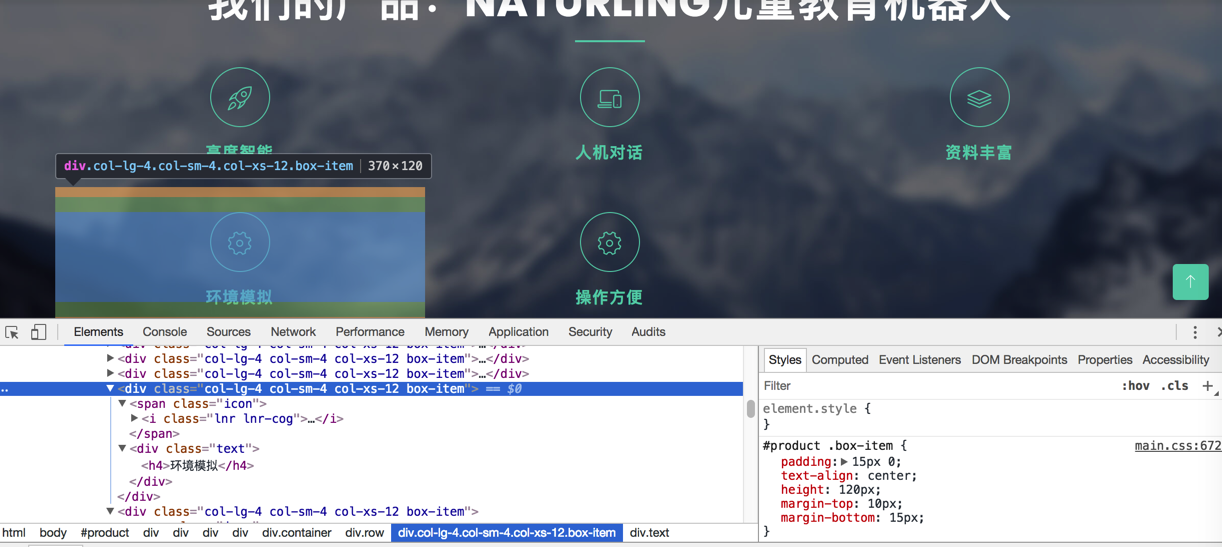
实现了基本的效果:
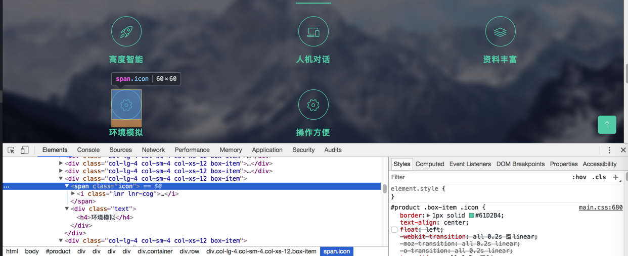
【后记】
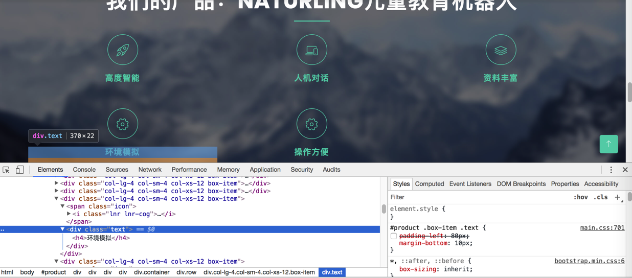
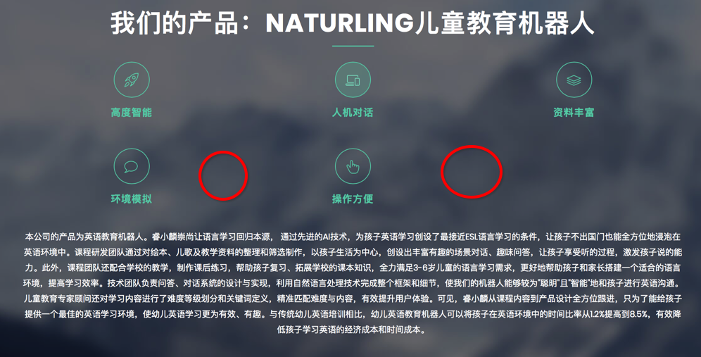
需要把后2个图标,变成居中:
再去调试看看:
用:
<code> <div class="row"> <div class="col-lg-12 col-md-12 col-xs-12"> <div class="container"> <div class="row"> <div class="col-lg-4 col-sm-4 col-xs-12 box-item"> <span class="icon"> <i class="lnr lnr-rocket"></i> </span> <div class="text"> <h4>高度智能</h4> </div> </div> <div class="col-lg-4 col-sm-4 col-xs-12 box-item"> <span class="icon"> <i class="lnr lnr-laptop-phone"></i> </span> <div class="text"> <h4>人机对话</h4> </div> </div> <div class="col-lg-4 col-sm-4 col-xs-12 box-item"> <span class="icon"> <i class="lnr lnr-layers"></i> </span> <div class="text"> <h4>资料丰富</h4> </div> </div> </div> <div class="row"> <div class="col-lg-6 col-sm-6 col-xs-12 box-item"> <span class="icon"> </code>
<i class=”lnr lnr-bubble”></i>
</span>
<div class=”text”>
<h4>环境模拟</h4>
</div>
</div>
<div class=”col-lg-6 col-sm-6 col-xs-12 box-item”>
<span class=”icon”>
<i class=”lnr lnr-pointer-up”></i>
</span>
<div class=”text”>
<h4>操作方便</h4>
</div>
</div>
</div>
</div>
</div>
</div>
效果:
但是还是不完美,第二行没有完全居中的那种效果。
最后用:
<code> <div class="row"> <div class="col-lg-12 col-md-12 col-xs-12"> <div class="container"> <div class="row"> <div class="col-lg-4 col-sm-4 col-xs-12 box-item"> <span class="icon"> <i class="lnr lnr-rocket"></i> </span> <div class="text"> <h4>高度智能</h4> </div> </div> <div class="col-lg-4 col-sm-4 col-xs-12 box-item"> <span class="icon"> <i class="lnr lnr-laptop-phone"></i> </span> <div class="text"> <h4>人机对话</h4> </div> </div> <div class="col-lg-4 col-sm-4 col-xs-12 box-item"> <span class="icon"> <i class="lnr lnr-layers"></i> </span> <div class="text"> <h4>资料丰富</h4> </div> </div> </div> <div class="row"> <div class="col-lg-6 col-sm-6 col-xs-12 box-item"> <span class="icon move-right"> <i class="lnr lnr-bubble"></i> </span> <div class="text move-right"> <h4>环境模拟</h4> </div> </div> <div class="col-lg-6 col-sm-6 col-xs-12 box-item"> <span class="icon move-left"> <i class="lnr lnr-pointer-up"></i> </span> <div class="text move-left"> <h4>操作方便</h4> </div> </div> </div> </div> </div> </div> </code>
加上css:
<code>
#product .box-item .icon {
  border: 1px solid #61D2B4;
  text-align: center;
  /* float: left; */
  -webkit-transition: all 0.2s linear;
  -moz-transition: all 0.2s linear;
  -o-transition: all 0.2s linear;
  transition: all 0.2s linear;
  margin-bottom: 15px;
}

#product .box-item .move-right {
  margin-left: 32%;
}

#product .box-item .move-left {
  margin-right: 32%;
}
</code>
勉强实现了效果:
缺点是:
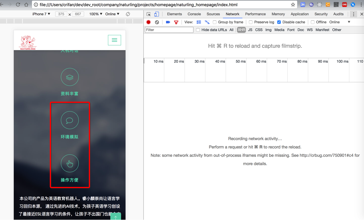
移动端会看到偏移:
无意间看到meida的查询语句:
所以再去研究,让上述css只针对大屏幕有效,小屏幕的移动设备无效
然后去试了试:
<code>@media (min-width: 768px) {
#product .box-item .move-right {
margin-left: 32%;
}
#product .box-item .move-left {
margin-right: 32%;
}
}
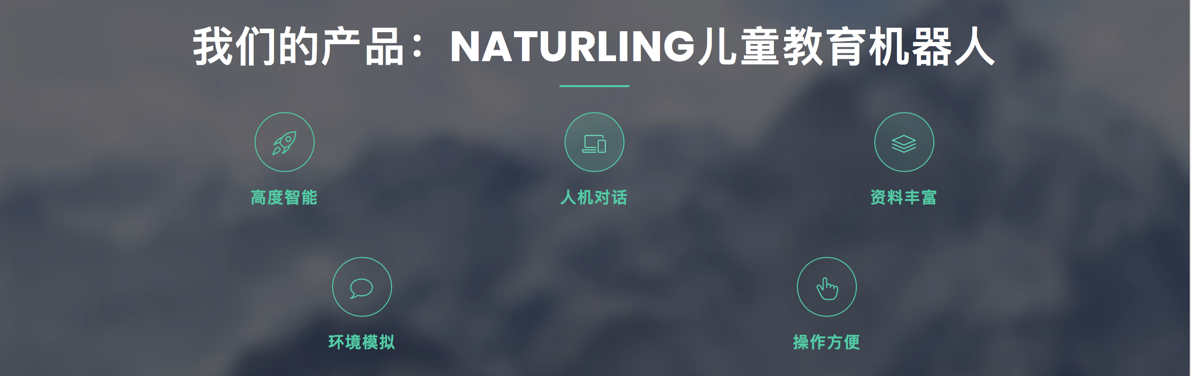
</code>达到要的效果了,移动端该段css补气效果,不偏移:
再顺带去查查media的用法
css media
css media教程
<code>@media (min-width: 700px) { ... }

(min-width: 700px) and (orientation: landscape) { ... }

@media tv and (min-width: 700px) and (orientation: landscape) { ... }

@media (min-width: 700px), handheld and (orientation: landscape) { ... }

….
</code>“all
适用于所有设备。
为了加载合适的文档到当前使用的可视窗口. 需要提前咨询 paged media(媒体屏幕尺寸), 以满足个别设备网页尺寸不匹配等问题。
screen
主要适用于彩色的电脑屏幕
speech
解析speech这个合成器. 注意: CSS2已经有一个相似的媒体类型叫aural.可以看以下附录”
<code>@media print {
  body { font-size: 10pt }
}
@media screen {
  body { font-size: 13px }
}
@media screen, print {
  body { line-height: 1.2 }
}
@media only screen
  and (min-device-width: 320px)
  and (max-device-width: 480px)
  and (-webkit-min-device-pixel-ratio: 2) {
    body { line-height: 1.4 }
}
</code>【CSS3 入门教程系列】CSS3 Media Queries 实现响应式设计 – CSDN博客
CSS3 Media Queries_media queries, css3属性详解 教程_w3cplus
<code> <link href="css/reset.css" rel="stylesheet" type="text/css" media="screen" /> <link href="css/style.css" rel="stylesheet" type="text/css" media="all" /> <link href="css/print.css" rel="stylesheet" type="text/css" media="print" /> </code>
<style type=”text/css” media=”screen”>
@import url(“css/style.css”);
</style>
<link rel=”stylesheet” media=”screen and (max-width: 600px)” href=”small.css” />
转载请注明:在路上 » 【已解决】给公司主页中添加产品特点和产品介绍