折腾:
【已解决】ReactJS中如何画左右叠加图的ECharts图表
已经通过:
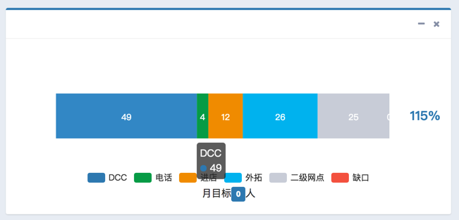
let curEchartsOption = { tooltip : { trigger: ‘item’ }, legend: { show: true, x: ‘center’, y: ‘bottom’, data: [ ‘DCC’, ‘电话’, ‘进店’, ‘外拓’, ‘二级网点’, ‘缺口’ ] }, xAxis: { show: false, type: ‘value’ }, yAxis: { show: false, type: ‘category’ }, series: [ { name: ‘DCC’, type: ‘bar’, stack: ‘总量’, label: { normal: { show: true, position: ‘inside’ } }, itemStyle: { normal: { color: ValueColor.DARK_BLUE } }, data: [49] }, { name: ‘电话’, type: ‘bar’, stack: ‘总量’, label: { normal: { show: true, position: ‘inside’ } }, itemStyle: { normal: { color: ValueColor.GREEN } }, data: [4] }, { name: ‘进店’, type: ‘bar’, stack: ‘总量’, label: { normal: { show: true, position: ‘inside’ } }, itemStyle: { normal: { color: ValueColor.YELLOW } }, data: [12] }, { name: ‘外拓’, type: ‘bar’, stack: ‘总量’, label: { normal: { show: true, position: ‘inside’ } }, itemStyle: { normal: { color: ValueColor.LIGHT_BLUE } }, data: [26] }, { name: ‘二级网点’, type: ‘bar’, stack: ‘总量’, label: { normal: { show: true, position: ‘inside’ } }, itemStyle: { normal: { color: ValueColor.GRAY } }, data: [25] }, { name: ‘缺口’, type: ‘bar’, stack: ‘总量’, label: { normal: { show: true, position: ‘inside’ } }, itemStyle: { normal: { color: ValueColor.RED } }, data: [0] } ] }; |
实现了效果:
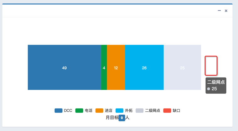
但是想要在右边显示出对应的内容:
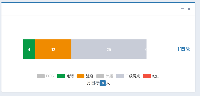
结果发现了别人不是放在图表厘米的,是单独画出来的:
此处还是希望在图表内部实现
echarts 堆叠柱状图 单个
Echarts中堆叠柱状图,只显示总数的一种思路。 – 大道甚夷 – 博客园
-》
https://github.com/moonbreezee/blog/issues/2
-》
https://github.com/moonbreezee/blog/blob/master/Echarts/moreBarTotleNumber.html
echarts中堆叠柱状图实现顶部显示总量 – 小晓峰 – 博客园
此处,暂时不考虑,legend中点击某组数据被去掉后,总数动态更新。
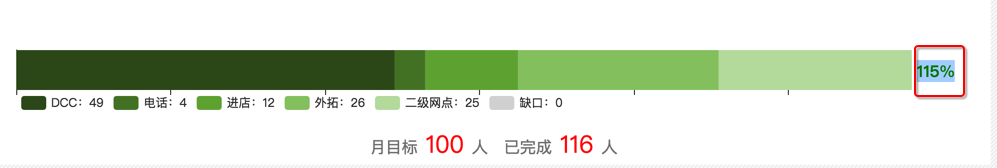
结果用:
, { name: ‘完成率’, type: ‘bar’, stack: ‘总量’, label: { normal: { show: true, position: ‘insideRight’, formatter:'{c}%’, } }, itemStyle: { normal: { color: ValueColor.RED } }, data: [115] } |
但是:
最右边虽然是显示出了百分比,但是却把整个宽度也显示出来了。。。
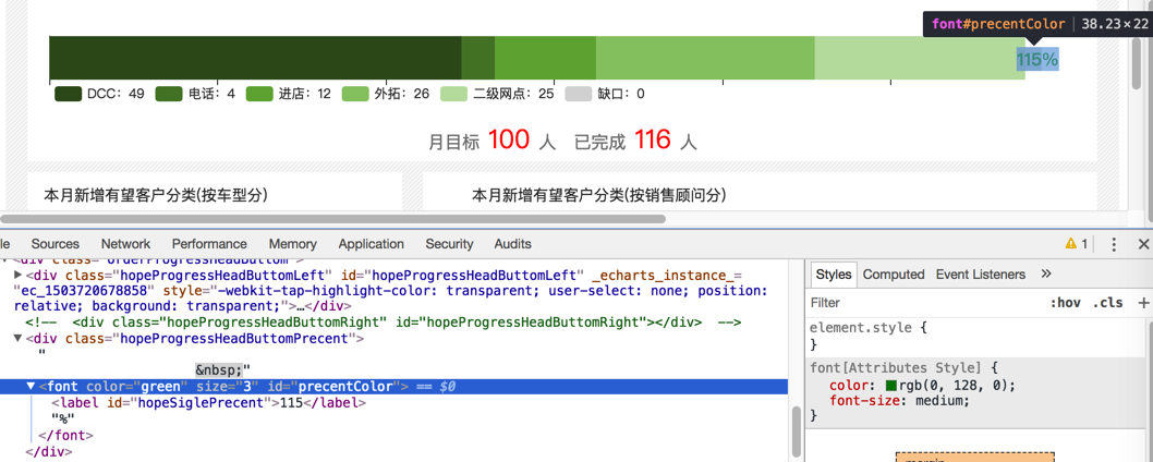
试试:
{ name: ‘完成率’, type: ‘bar’, stack: ‘总量’, label: { normal: { show: true, position: ‘insideRight’, // formatter:'{c}%’, formatter:'{c}’, } }, itemStyle: { normal: { color: ValueColor.RED } }, data: [‘115%’] } |
结果完成率不显示了。
echarts 堆叠柱状图 总数
Echarts 堆积柱状图 数据标签求和怎么实现?(急求)_echarts吧_百度贴吧
堆积柱形图如何实现,在柱形图最上方显示总计值 · Issue #3096 · ecomfe/echarts
“只显示最上方的柱状图的 label,然后在 formatter 中计算总数”
这个思路貌似可以?
但是如果legend中点击掉最上方(最右边)的数据,则总数就也消失了啊。。
好像title可以用来显示?
然后去设置了,果然可以:
【总结】
此处的前提是:
不需要使用title,所以可以借用title,在柱状堆叠图右边放上要显示的百分比。
代码:
核心代码:
title: { show: true, text: ‘115%’, textStyle: { color: ValueColor.DARK_BLUE, align: ‘right’, verticalAlign: ‘middle’ }, left: ‘right’, top: ‘middle’, }, |
完整代码:
let curEchartsOption = { title: { show: true, text: ‘115%’, textStyle: { color: ValueColor.DARK_BLUE, align: ‘right’, verticalAlign: ‘middle’ }, left: ‘right’, top: ‘middle’, }, tooltip : { trigger: ‘item’ }, legend: { show: true, x: ‘center’, y: ‘bottom’, data: [ ‘DCC’, ‘电话’, ‘进店’, ‘外拓’, ‘二级网点’, ‘缺口’ ] }, xAxis: { show: false, type: ‘value’ }, yAxis: { show: false, type: ‘category’ }, series: [ { name: ‘DCC’, type: ‘bar’, stack: ‘总量’, label: { normal: { show: true, position: ‘inside’ } }, itemStyle: { normal: { color: ValueColor.DARK_BLUE } }, data: [49] }, { name: ‘电话’, type: ‘bar’, stack: ‘总量’, label: { normal: { show: true, position: ‘inside’ } }, itemStyle: { normal: { color: ValueColor.GREEN } }, data: [4] }, { name: ‘进店’, type: ‘bar’, stack: ‘总量’, label: { normal: { show: true, position: ‘inside’ } }, itemStyle: { normal: { color: ValueColor.YELLOW } }, data: [12] }, { name: ‘外拓’, type: ‘bar’, stack: ‘总量’, label: { normal: { show: true, position: ‘inside’ } }, itemStyle: { normal: { color: ValueColor.LIGHT_BLUE } }, data: [26] }, { name: ‘二级网点’, type: ‘bar’, stack: ‘总量’, label: { normal: { show: true, position: ‘inside’ } }, itemStyle: { normal: { color: ValueColor.GRAY } }, data: [25] }, { name: ‘缺口’, type: ‘bar’, stack: ‘总量’, label: { normal: { show: true, position: ‘inside’ } }, itemStyle: { normal: { color: ValueColor.RED } }, data: [0] }, // { // name: ‘完成率’, // type: ‘bar’, // stack: ‘总量’, // label: { // normal: { // show: true, // position: ‘insideRight’, // // formatter:'{c}%’, // formatter:'{c}’, // } // }, // itemStyle: { // normal: { // color: ValueColor.RED // } // }, // data: [‘115%’] // } ] }; |
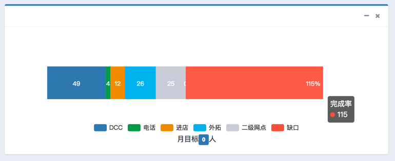
效果:
好处是:
(1)和整个Chart表示一体的

(2)点击了其它legend,去掉某些组数据后,仍会显示:
转载请注明:在路上 » 【已解决】ECharts中水平的叠加柱状图的最右边显示值