折腾:
【未解决】AntD Pro中支持剧本剧本编写时拖动排序单个对话
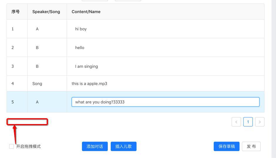
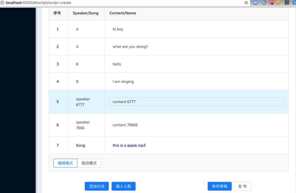
期间,已经实现了基本的,既支持可拖动实现排序,也支持点击单元格支持实时编辑的表格了:
接下来去优化:
- 去把两种表格的代码合并
- 把模式切换的按钮,放在table内部的底部的左边
- 且参考:
- 单选框 Radio – Ant Design
- https://2x.ant.design/components/radio-cn/
- 去换成 编辑模式 拖动模式 之间通过radio button去切换
- 把分页去掉
- 模式切换时row行高不同,需要优化成相同的行高


去优化
经过一番调试,已经:
- 合并两种表格的代码:最后再贴完整代码
- 去掉了分页:
- 加上了footer:
- 注意一定要个字符串或者函数
现在就剩下:
需要在两种模式切换时,确保高度和对齐等显示效果一致
因为现在是不一致:
需要调节成一致效果
先要去解决:
可编辑的cell的左对齐:
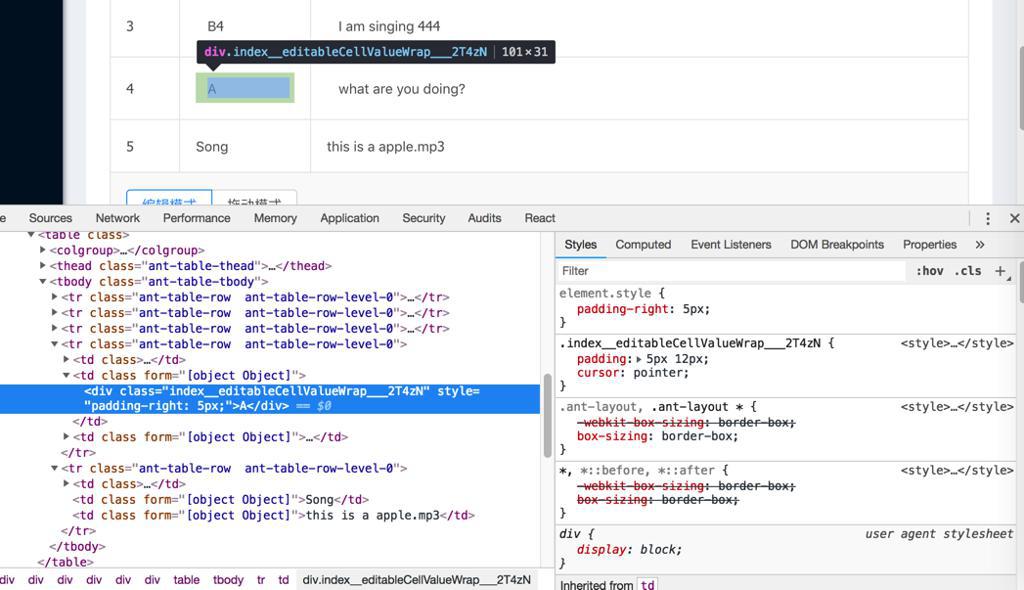
和不可编辑的cell的左对齐:
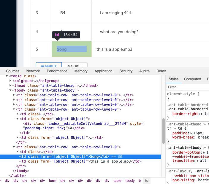
不一致的问题。
相关代码是:
    return (
      <td ref={node => (this.cell = node)} {...restProps}>
        {editable ? (
          <EditableContext.Consumer>
            {(form) => {
              console.log("EditableContext.Consumer: form=", form)

              this.form = form;
              return (
                editing ? (
                  <FormItem style={{ margin: 0 }}>
                    {form.getFieldDecorator(dataIndex, {
                      rules: [{
                        required: true,
                        message: `${title} is required.`,
                      }],
                      initialValue: record[dataIndex],
                    })(
                      <Input
                        ref={node => (this.input = node)}
                        onPressEnter={this.save}
                      />
                    )}
                  </FormItem>
                ) : (
                  <div
                    className={styles.editableCellValueWrap}
                    // className={styles.nonEditableCellValueWrap}
                    style={{ paddingRight: 5 }}
                    onClick={this.toggleEdit}
                  >
                    {restProps.children}
                  </div>
                )
              );
            }}
          </EditableContext.Consumer>
        ) : restProps.children}
      </td>
    );
和:
@import '~antd/lib/style/themes/default.less';

.editable-cell {
  position: relative;
}

// .nonEditableCellValueWrap {
//   padding: 5px 12px;
//   cursor: pointer;
//   background: grey;
// }

.editableCellValueWrap {
  padding: 5px 12px;
  // padding: 2px 4px;
  cursor: pointer;
}

// .editable-row:hover .editableCellValueWrap {
// .editableRow:hover .editableCellValueWrap {
.editableCellValueWrap:hover {
  border: 1px solid #d9d9d9;
  border-radius: 4px;
  padding: 4px 11px;
  // padding: 2px 4px;
}
现在去调节
然后最后用:
/src/components/EditableCell/index.js
        // ) : restProps.children}
      ) : (
        <div
          className={styles.nonEditableCellValueWrap}
        >
          {restProps.children}
        </div>
      )
      }
和:
/src/components/EditableCell/index.less
.nonEditableCellValueWrap {
padding: 5px 12px;
cursor: auto;
color: darkcyan;
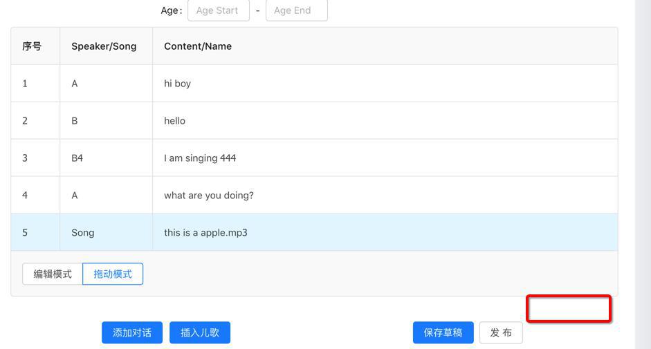
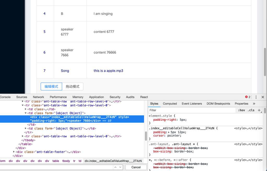
}达到效果:不可编辑的cell,左边对齐正常了,和可编辑的cell左边一致了:

然后再去解决:
拖拽模式和编辑模式之间,cell高度和padding等不同的情况
而此处注意到之前的EditableTable中是:
  components = {
    body: {
      row: EditableFormRow,
      cell: EditableCell,
    },
  }
注定了cell用EditableCell,其中EditableCell的render中对单个cell,指定style的
而此处的DragableTable中,没有指定cell:
  components = {
    body: {
      row: DragableBodyRow,
    },
  }
所以没法直接指定cell的style样式
所以想办法去指定
参考:
去找找,table中是否可以直接指定cell的css
rowClassName
表格行的类名
Function(record, index):string
–
好像是要找的,去看看用法举例
巧了在antd pro中真的找到了实例:
src/routes/Forms/TableForm.js
      <Fragment>
        <Table
          ...
          rowClassName={record => {
            return record.editable ? styles.editable : '';
          }}
        />
和:
/src/routes/Forms/style.less
.editable {
  td {
    padding-top: 13px !important;
    padding-bottom: 12.5px !important;
  }
}
所以可以参考这个写法,去试试
然后是可以用代码:
src/components/DragableTable/index.js
return (
<Table
pagination={false}
footer={this.props.footer}
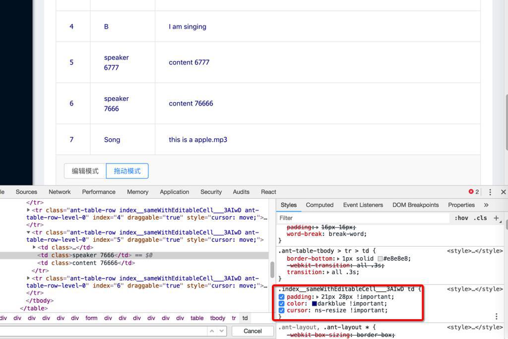
rowClassName={(record, index) => {
const curRowStyle = styles.sameWithEditableCell
console.log("rowClassName: record=", record, " ,index=", index, ", curRowStyle=", curRowStyle)
return curRowStyle
}}/src/components/DragableTable/index.less
@import '~antd/lib/style/themes/default.less';

.sameWithEditableCell {
  td {
    // padding: 5px 12px;
    // padding: 16px 18px;
    padding: 21px 28px !important;
    // color: darkcyan !important;
    color: darkblue !important;
    cursor: ns-resize !important;
  }
}
实现,相同的效果的:
【总结】
至此,用如下代码:
在外部调用合并后的 可拖动可编辑的表格:
import React, { PureComponent } from 'react'
import { connect } from 'dva'
import { routerRedux } from 'dva/router'
import {
  Col,
  Form,
  Input,
  Button,
  Card,
  InputNumber,
  Select,
  message,
  Modal,
  // Checkbox,
} from 'antd'
import PageHeaderLayout from '../../layouts/PageHeaderLayout'
...

// import DragableTable from '../../components/DragableTable'
// import EditableTable from '../../components/EditableTable'
import DragableEditableTable from '../../components/DragableEditableTable'

const FormItem = Form.Item;
const InputGroup = Input.Group;
const { TextArea } = Input;
const { Option } = Select;


@connect(({ loading, script, topic }) => ({
  submitting: loading.effects['script/submitRegularForm'],
  script,
  topic,
}))
@Form.create()
export default class ScriptCreate extends PureComponent {
  constructor(props) {
    super(props)

    // this.onDialogListChange = this.onDialogListChange.bind(this)
    // this.onEditableCellChange = this.onEditableCellChange.bind(this)
    // this.onDragableCheckChange = this.onDragableCheckChange.bind(this)
    this.syncDialogList = this.syncDialogList.bind(this)
    this.onTableModeChange = this.onTableModeChange.bind(this)

    this.state = {
      // dialogList: [],
      dialogList: this.demoItemList,
      // dragableChecked: false,
      tableMode: DragableEditableTable.TableMode.EDITABLE,

...
    }
  }

  /* eslint-disable */
  columns = [
    {
      title: '序号',
      width: "8%",
      editable: false,
      dataIndex: 'number',
      key: 'number',
      // rowKey: 'number',
      // fixed: 'left',
      render(text, record, index) {
        return index + 1;
      },
    },
    {
      width: "15%",
      editable: true,
      title: 'Speaker/Song',
      dataIndex: 'speakerOrSong',
      key: 'speakerOrSong',
    },
    {
      width: "75%",
      editable: true,
      title: 'Content/Name',
      dataIndex: 'contentOrName',
      key: 'contentOrName',
    },
  ]


  demoItemList = [
    {
      key: '1',
      speakerOrSong: 'A',
      contentOrName: 'hi boy',
      editable: true,
    },
    {
      key: '2',
      speakerOrSong: 'B',
      contentOrName: 'hello',
      editable: true,
    },
    {
      key: '3',
      speakerOrSong: 'A',
      contentOrName: 'what are you doing?',
      editable: true,
    },
    {
      key: '4',
      speakerOrSong: 'B',
      contentOrName: 'I am singing',
      editable: true,
    },
    {
      key: '5',
      speakerOrSong: 'Song',
      contentOrName: 'this is a apple.mp3',
      editable: false,
    },

  ]
...

  onTableModeChange(e) {
    console.log('onTableModeChange: e.target.value=', e.target.value);
    this.setState({ tableMode: e.target.value })
    console.log("after  change: this.state.tableMode=", this.state.tableMode)
  }

  syncDialogList(newDialogList){
    console.log("syncDialogList: newDialogList=", newDialogList)
    // console.log("before change: this.state.dialogList=", this.state.dialogList)
    this.setState({dialogList: newDialogList})
    console.log("after  change: this.state.dialogList=", this.state.dialogList)
  }

  render() {
    const { submitting, form } = this.props;
    const topicList = this.props.topic.topics;
    const { getFieldDecorator } = this.props.form;
...

    return (
      <PageHeaderLayout
        title="新建剧本"
      >
        <Card bordered={false}>
          ...

            {/* {this.buildDialog()} */}

            {/* {
              this.state.dragableChecked ? (
                <DragableTable
                  columns={this.columns}
                  itemList={this.state.dialogList}
                  onDragableListChange={this.onDialogListChange}
                />
              ) : (
                <EditableTable
                  columns={this.columns}
                  itemList={this.state.dialogList}
                  onEditableCellChange={this.onEditableCellChange}
                  form={this.props.form}
                />
              )
            } */}

            <DragableEditableTable
              tableMode={this.state.tableMode}
              columns={this.columns}
              itemList={this.state.dialogList}
              onTableDataChange={this.syncDialogList}
              onTableModeChange={this.onTableModeChange}
              form={this.props.form}
            />
...
          </Form>
        </Card>
      </PageHeaderLayout>
    );
  }
}
而合并后的表格是:
import React from 'react'
import {
  Radio,
} from 'antd'
import DragableTable from '../DragableTable'
import EditableTable from '../EditableTable'

const RadioButton = Radio.Button
const RadioGroup = Radio.Group

export default class DragableEditableTable extends
React.Component
 {
  /* eslint-disable */
  static TableMode = {
    EDITABLE: "editable",
    DRAGABLE: "dragable",
  }
  /* eslint-disable */
  // static defaultMode = DragableEditableTable.TableMode.DRAGABLE
  // static defaultMode = DragableEditableTable.TableMode.EDITABLE

  // state = {
  //   // mode: this.TableMode.EDITABLE,
  //   // mode: this.defaultMode,
  //   // mode: DragableEditableTable.defaultMode,
  //   // columns: [],
  //   // itemList: [],
  // }

  constructor(props){
    super(props)

    // this.onTableModeChange = this.onTableModeChange.bind(this)
    // this.onTableDataChange = this.onTableDataChange.bind(this)
    this.radioSelectFooter = this.radioSelectFooter.bind(this)

    console.log("DragableEditableTable constructor: props=", props)

    // console.log("this.props.columns=", this.props.columns)
    console.log("this.props.itemList=", this.props.itemList)
    console.log("this.props.tableMode=", this.props.tableMode)

    // this.state.itemList = this.props.itemList
    // this.state.columns = this.props.columns
    // console.log("this.state.mode=", this.state.mode)
  }

  // onTableModeChange(e) {
  //   console.log('onTableModeChange: e.target.value=', e.target.value);
  //   this.setState({
  //     mode: e.target.value,
  //   })
  // }

  // onTableDataChange(newDialogList){
  //   // update current state
  //   this.setState({dialogList: newDialogList})
  //   // callback parent to sync state
  //   this.props.onTableDataChange(newDialogList)
  // }

  // radioSelectFooter(onRadioChange, defautMode) {
  radioSelectFooter() {
    return (
      // <RadioGroup onChange={this.onTableModeChange} defaultValue={DragableEditableTable.defaultMode}>
      // <RadioGroup onChange={onRadioChange} defaultValue={defautMode}>
      <RadioGroup onChange={this.props.onTableModeChange} defaultValue={this.props.tableMode}>
        <RadioButton value={DragableEditableTable.TableMode.EDITABLE}>编辑模式</RadioButton>
        <RadioButton value={DragableEditableTable.TableMode.DRAGABLE}>拖动模式</RadioButton>
      </RadioGroup>
    )
  }

  render() {
    console.log("DragableEditableTable render: this.props.itemList=", this.props.itemList)

    const commonColumns = this.props.columns
    const commonItemList = this.props.itemList
    // const commonModeSelectorFooter = this.radioSelectFooter(this.props.onTableModeChange, this.props.tableMode)
    const commonModeSelectorFooter = this.radioSelectFooter
    const commonDataChange = this.props.onTableDataChange

    console.log("commonColumns=", commonColumns)
    console.log("commonItemList=", commonItemList)
    console.log("commonModeSelectorFooter=", commonModeSelectorFooter)
    console.log("commonDataChange=", commonDataChange)

    return (
      // {
        this.props.tableMode === DragableEditableTable.TableMode.DRAGABLE ? (
          <DragableTable
            columns={commonColumns}
            itemList={commonItemList}
            footer={commonModeSelectorFooter}
            onDragableListChange={commonDataChange}
          />
        ) : (
          <EditableTable
            columns={commonColumns}
            itemList={commonItemList}
            footer={commonModeSelectorFooter}
            onEditableCellChange={commonDataChange}
            form={this.props.form}
          />
        )
      // }
    )
  }
}

DragableEditableTable.defaultProps = {
  tableMode: DragableEditableTable.TableMode.EDITABLE,
  itemList: [],
  onTableDataChange: (newItemList) => {},
  onTableModeChange: (newMode) => {},
};
内部调用的分别是:
/src/components/EditableTable/index.js
import React from 'react'
import { EditableFormRow, EditableCell } from '../EditableCell'
import { Table } from 'antd'

export default class EditableTable extends
React.Component
 {
  constructor(props){
    super(props)
    console.log("EditableTable constructor: props=", props)

    console.log("this.props.columns=", this.props.columns)
    console.log("this.props.itemList=", this.props.itemList)
    console.log("this.props.onEditableCellChange=", this.props.onEditableCellChange)

    this.handleSaveEditableCell = this.handleSaveEditableCell.bind(this)

    this.state.itemList = this.props.itemList;
    this.state.columns = this.props.columns;
  }

  state = {
    columns: [],
    itemList: [],
  }

  // componentWillReceiveProps(nextProps){
  //   console.log("EditableTable componentWillReceiveProps: nextProps=", nextProps)
  //   console.log("this.props.itemList=", this.props.itemList)
  //   if (this.props.itemList) {
  //     this.setState({itemList: this.props.itemList})
  //     console.log("updated this.state.itemList=", this.state.itemList)
  //   }
  // }

  components = {
    body: {
      row: EditableFormRow,
      cell: EditableCell,
    },
  }

  handleSaveEditableCell = (row) => {
    console.log("handleSaveEditableCell: row=", row)

    const newItemList = [...this.state.itemList]
    console.log("newItemList=", newItemList)
    const index = newItemList.findIndex(item => row.key === item.key)
    console.log("index=", index)
    const item = newItemList[index]
    console.log("item=", item)
    newItemList.splice(index, 1, {
      ...item,
      ...row,
    })
    console.log("newItemList=", newItemList)
    this.setState({ itemList: newItemList })
    console.log("after: this.state.itemList=", this.state.itemList)

    this.props.onEditableCellChange(this.state.itemList)
    // console.log("newItemList=", newItemList)
    // this.props.onEditableCellChange(newItemList)
  }

  render() {
    console.log("EditableTable render: this.state.itemList=", this.state.itemList)

    const curColumns = this.state.columns.map((col) => {
      console.log("curColumns: col=", col)

      if (!col.editable) {
        return col
      }

      return {
        ...col,
        onCell: (record) => {

          /*
          * Note:
          * 1. each cell is editable is set by:
          * first priority: cell editable by each item/cell in this.props.itemList
          * then check: column editable by each column in this.props.columns
          */
          let cellIsEditable
          if (record.editable !== undefined) {
            cellIsEditable = record.editable
          } else {
            cellIsEditable = col.editable
          }
          console.log("cellIsEditable=", cellIsEditable, ", record=", record)

          return {
            record,
            editable: cellIsEditable,
            dataIndex: col.dataIndex,
            title: col.title,
            form: this.props.form,
            handleSave: this.handleSaveEditableCell,
          }
        },
      }
    })

    return (
      <Table
        pagination={false}
        footer={this.props.footer}
        bordered
        columns={curColumns}
        dataSource={this.state.itemList}
        components={
this.components
}
        onRow={(record, index) => ({
          index,
        })}
      />
    );
  }
}

EditableTable.defaultProps = {
  itemList: [],
  onEditableCellChange: (newItemList) => {},
  footer: '',
};
/src/components/EditableCell/index.js
import React, { PureComponent } from 'react';
import styles from './index.less';
import { Form, Input } from 'antd';

const FormItem = Form.Item;
const EditableContext = React.createContext();

const EditableRow = ({ form, index, ...props }) => (
  <EditableContext.Provider value={form}>
    <tr {...props} />
  </EditableContext.Provider>
);

export const EditableFormRow = Form.create()(EditableRow);

// export default class EditableCell extends PureComponent {
export class EditableCell extends PureComponent {

  state = {
    editing: false,
  }

  componentDidMount() {
    console.log("EditableCell componentDidMount: this.props.editable", this.props.editable)

    if (this.props.editable) {
      document.addEventListener('click', this.handleClickOutside, true);
    }
  }

  componentWillUnmount() {
    if (this.props.editable) {
      document.removeEventListener('click', this.handleClickOutside, true);
    }
  }

  toggleEdit = () => {
    console.log("toggleEdit=")
    console.log("this.state.editing=", this.state.editing)

    const editing = !this.state.editing;
    this.setState({ editing }, () => {
      if (editing) {
        this.input.focus();
      }
    });
  }

  handleClickOutside = (e) => {
    const { editing } = this.state;
    if (editing && this.cell !== e.target && !this.cell.contains(e.target)) {
      this.save();
    }
  }

  save = () => {
    console.log("save")
    const { record, handleSave } = this.props;
    console.log("record=", record)
    this.form.validateFields((error, values) => {
      console.log("form.validateFields=: error", error, ", values=", values)

      if (error) {
        return
      }
      this.toggleEdit();
      handleSave({ ...record, ...values });
    });
  }

  render() {
    const { editing } = this.state;

    const {
      editable,
      dataIndex,
      title,
      record,
      index,
      // handleSave,
      ...restProps
    } = this.props;

    // console.log("editing=", editing, ", editable=", editable, ", record=", record)

    return (
      <td ref={node => (this.cell = node)} {...restProps}>
        {editable ? (
          <EditableContext.Consumer>
            {(form) => {
              console.log("EditableContext.Consumer: form=", form)

              this.form = form;
              return (
                editing ? (
                  <FormItem style={{ margin: 0 }}>
                    {form.getFieldDecorator(dataIndex, {
                      rules: [{
                        required: true,
                        message: `${title} is required.`,
                      }],
                      initialValue: record[dataIndex],
                    })(
                      <Input
                        ref={node => (this.input = node)}
                        onPressEnter={this.save}
                      />
                    )}
                  </FormItem>
                ) : (
                  <div
                    className={styles.editableCellValueWrap}
                    // className={styles.nonEditableCellValueWrap}
                    style={{ paddingRight: 5 }}
                    onClick={this.toggleEdit}
                  >
                    {restProps.children}
                  </div>
                )
              );
            }}
          </EditableContext.Consumer>
        // ) : restProps.children}
      ) : (
        <div
          className={styles.nonEditableCellValueWrap}
        >
          {restProps.children}
        </div>
      )
      }
      </td>
    );
  }
}
对应less的css:
/src/components/EditableCell/index.less
@import '~antd/lib/style/themes/default.less';

.editable-cell {
  position: relative;
}

.nonEditableCellValueWrap {
  padding: 5px 12px;
  cursor: auto;
  // color: darkcyan;
  color: darkblue;
}

.editableCellValueWrap {
  padding: 5px 12px;
  // padding: 2px 4px;
  cursor: pointer;
  // cursor: -webkit-grab;
}

// .editable-row:hover .editableCellValueWrap {
// .editableRow:hover .editableCellValueWrap {
.editableCellValueWrap:hover {
  border: 1px solid #d9d9d9;
  border-radius: 4px;
  padding: 4px 11px;
  // padding: 2px 4px;
}
可拖动的表格:
/src/components/DragableTable/index.js
import React from 'react'
import { Table } from 'antd'
import { DragDropContext } from 'react-dnd'
import HTML5Backend from 'react-dnd-html5-backend'
import update from 'immutability-helper'
import DragableBodyRow from '../DragableBodyRow'
import styles from './index.less';

@DragDropContext(HTML5Backend)
export default class DragableTable extends
React.Component
 {
  constructor(props){
    super(props)
    console.log("DragableTable constructor: props=", props)

    console.log("this.props.columns=", this.props.columns)
    console.log("this.props.itemList=", this.props.itemList)
    console.log("this.props.onDragableListChange=", this.props.onDragableListChange)

    this.state.itemList = this.props.itemList;
    this.state.columns = this.props.columns;
  }

  state = {
    columns: [],
    itemList: [],
  }

  // componentWillReceiveProps(nextProps){
  //   console.log("DragableTable componentWillReceiveProps: nextProps=", nextProps)
  //   console.log("this.props.itemList=", this.props.itemList)
  //   if (this.props.itemList) {
  //     this.setState({itemList: this.props.itemList})
  //     console.log("updated this.state.itemList=", this.state.itemList)
  //   }
  // }

  components = {
    body: {
      row: DragableBodyRow,
    },
  }

  moveRow = (dragIndex, hoverIndex) => {
    const { itemList } = this.state;
    const dragRow = itemList[dragIndex];

    this.setState(
      update(this.state, {
        itemList: {
          $splice: [[dragIndex, 1], [hoverIndex, 0, dragRow]],
        },
      }),
    )

    console.log("moveRow: this.state.itemList=", this.state.itemList)
    this.props.onDragableListChange(this.state.itemList)
  }

  render() {
    console.log("DragableTable render: this.state.itemList=", this.state.itemList)

    return (
      <Table
        pagination={false}
        footer={this.props.footer}
        rowClassName={(record, index) => {
          const curRowStyle = styles.sameWithEditableCell
          console.log("rowClassName: record=", record, " ,index=", index, ", curRowStyle=", curRowStyle)
          return curRowStyle
        }}
        bordered
        columns={this.state.columns}
        dataSource={this.state.itemList}
        components={
this.components
}
        onRow={(record, index) => ({
          index,
          moveRow: this.moveRow,
        })}
      />
    );
  }
}

DragableTable.defaultProps = {
  itemList: [],
  onDragableListChange: (dragSortedList) => {},
  footer: '',
};
对应less的css:
/src/components/DragableTable/index.less
@import '~antd/lib/style/themes/default.less';

.sameWithEditableCell {
  td {
    // padding: 5px 12px;
    // padding: 16px 18px;
    padding: 21px 28px !important;
    // color: darkcyan !important;
    color: darkblue !important;
    cursor: ns-resize !important;
  }
}
内部的row:
/src/components/DragableBodyRow/index.js
import React from 'react';
import { DragSource, DropTarget } from 'react-dnd';

function dragDirection(
  dragIndex,
  hoverIndex,
  initialClientOffset,
  clientOffset,
  sourceClientOffset,
) {
  const hoverMiddleY = (initialClientOffset.y - sourceClientOffset.y) / 2;
  const hoverClientY = clientOffset.y - sourceClientOffset.y;
  if (dragIndex < hoverIndex && hoverClientY > hoverMiddleY) {
    return 'downward';
  }
  if (dragIndex > hoverIndex && hoverClientY < hoverMiddleY) {
    return 'upward';
  }
}

class BodyRow extends
React.Component
 {
  render() {
    const {
      isOver,
      connectDragSource,
      connectDropTarget,
      moveRow,
      dragRow,
      clientOffset,
      sourceClientOffset,
      initialClientOffset,
      ...restProps
    } = this.props;
    const style = { ...restProps.style, cursor: 'move' };

    let className = restProps.className;
    if (isOver && initialClientOffset) {
      const direction = dragDirection(
        dragRow.index,
        restProps.index,
        initialClientOffset,
        clientOffset,
        sourceClientOffset
      );
      if (direction === 'downward') {
        className += ' drop-over-downward';
      }
      if (direction === 'upward') {
        className += ' drop-over-upward';
      }
    }

    return connectDragSource(
      connectDropTarget(
        <tr
          {...restProps}
          className={className}
          style={style}
        />
      )
    );
  }
}

const rowSource = {
  beginDrag(props) {
    return {
      index: props.index,
    };
  },
};

const rowTarget = {
  drop(props, monitor) {
    const dragIndex = monitor.getItem().index;
    const hoverIndex = props.index;

    // Don't replace items with themselves
    if (dragIndex === hoverIndex) {
      return;
    }

    // Time to actually perform the action
    props.moveRow(dragIndex, hoverIndex);

    // Note: we're mutating the monitor item here!
    // Generally it's better to avoid mutations,
    // but it's good here for the sake of performance
    // to avoid expensive index searches.
    monitor.getItem().index = hoverIndex;
  },
};


// const DragableBodyRow = DropTarget('row', rowTarget, (connect, monitor) => ({
const DragableBodyRow = DropTarget('row', rowTarget, (connect, monitor) => ({
  connectDropTarget: connect.dropTarget(),
  isOver: monitor.isOver(),
  sourceClientOffset: monitor.getSourceClientOffset(),
}))(
  DragSource('row', rowSource, (connect, monitor) => ({
    connectDragSource: connect.dragSource(),
    dragRow: monitor.getItem(),
    clientOffset: monitor.getClientOffset(),
    initialClientOffset: monitor.getInitialClientOffset(),
  }))(BodyRow)
);

export default DragableBodyRow
从而实现了优化:
- 合并了可拖动的DragableTable和可编辑的EditableTable
- 通过<Table pagination={false}实现了去掉分页
- 通过指定Table的footer实现了显示 radiobutton去切换 两种模式:拖动模式 分页模式
- 通过设置DragableTable的Table的rowClassName,实现了模式切换后表格的样式不变
- 尤其是cell的padding和高度
- 避免了用户在切换后模式后,觉得表格单元格高低不同而觉得太突兀
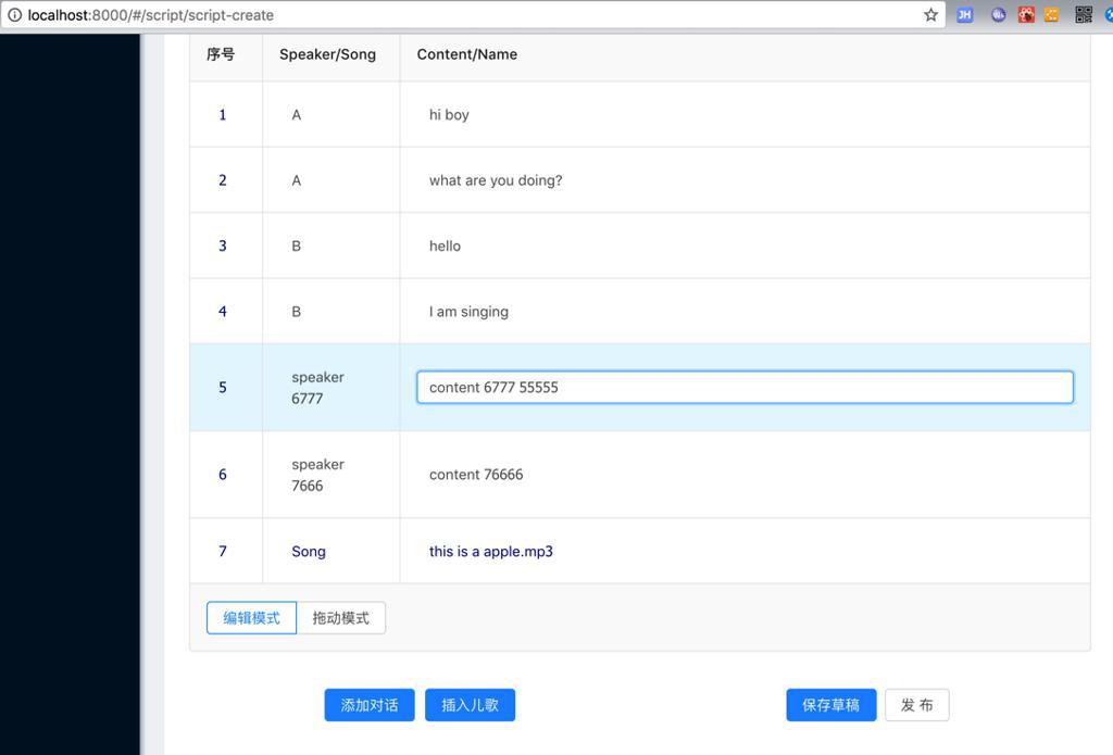
效果:
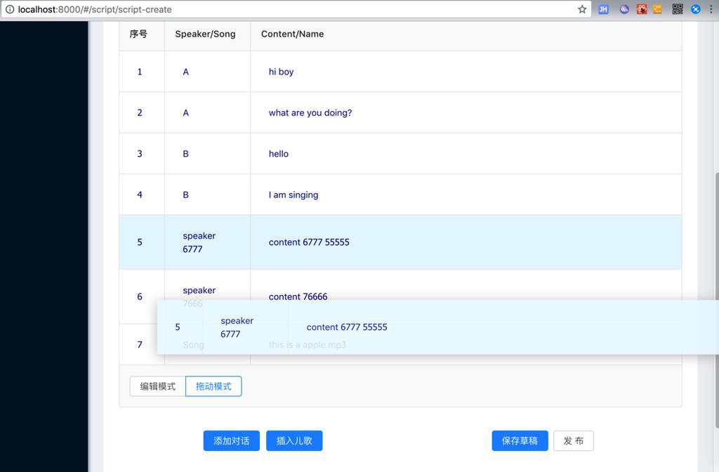
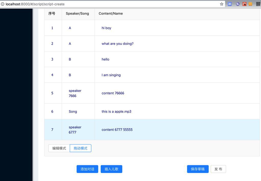
切换后:
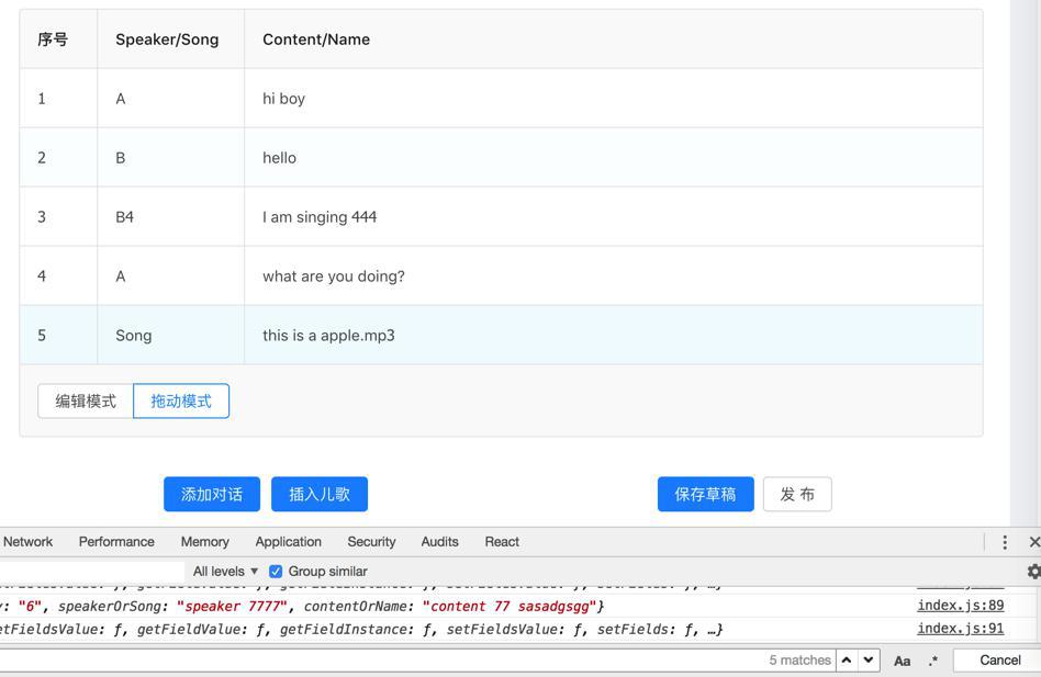
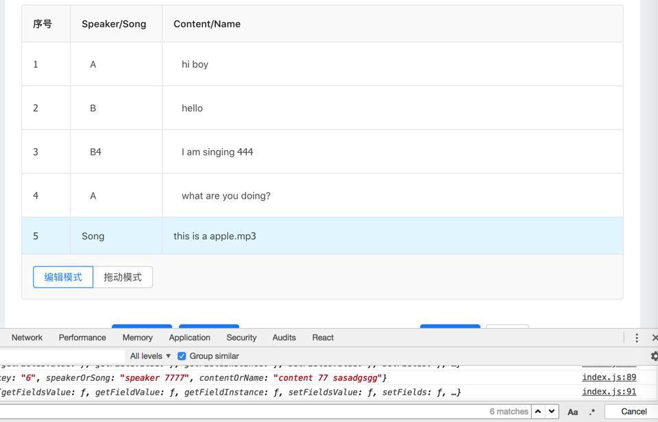
去拖动:
转载请注明:在路上 » 【已解决】剧本编写系统中优化可拖动排序可编辑单元格的表格