折腾:
【已解决】微信小程序开发工具中去画界面实现首页布局
期间,需要去小程序中实现这样的界面效果:

即,同一行内:
- 左边是输入框
- 输入了内容后,显示x,点击x可以清除已输入的内容
- 右边是按钮
小程序 布局 input button 同一行
先自己去试试
-》
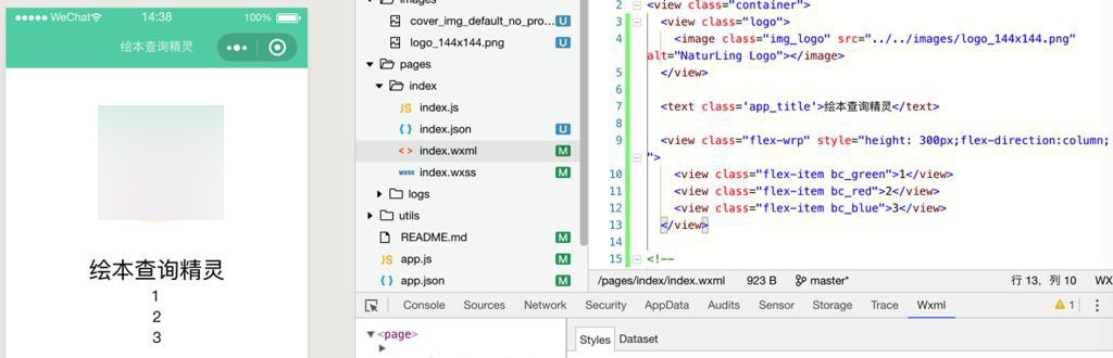
不论是:
  <view class="flex-wrp" style="flex-direction:row;">
    <view class="flex-item bc_green">1</view>
    <view class="flex-item bc_red">2</view>
    <view class="flex-item bc_blue">3</view>
  </view>
还是:
  <view class="flex-wrp" style="height: 300px;flex-direction:column;">
    <view class="flex-item bc_green">1</view>
    <view class="flex-item bc_red">2</view>
    <view class="flex-item bc_blue">3</view>
  </view>
都是竖着显示的。。。
试了半天:
.input_and_query{
  width: 80%;

  /* margin-left: 39px;
  margin-right: 39px; */
  /* padding-left: 39px;
  padding-right: 39px; */

  vertical-align: center;
}

#queryInput{
  font-size: 14px;
  border-radius: 16px;
  height: 38px;

  float:left;
  /* width:70%; */
}

#queryButton{
  font-size: 14px;
  border-radius: 16px;
  height: 38px;

  float:left;
  /* width:30%; */
}
效果是:
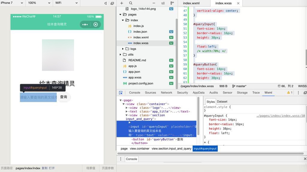
还是不对。
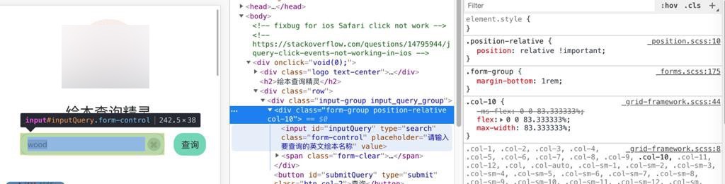
参考:
去试试把input放到form中
发现也没有合适的左右布局。算了。
又试了试:
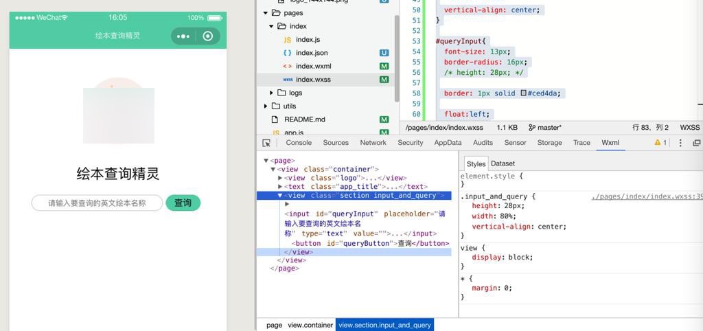
  <view class="section input_and_query">
    <input id="queryInput" type="text" placeholder="请输入要查询的英文绘本名称" value=""></input>
    <button id="queryButton">查询</button>
  </view>
和
.input_and_query{
  height: 28px;

  width: 80%;

  /* margin-left: 39px;
  margin-right: 39px; */
  /* padding-left: 39px;
  padding-right: 39px; */

  vertical-align: center;
}

#queryInput{
  font-size: 14px;
  border-radius: 8px;
  height: 28px;

  border: 1px solid #ced4da;

  float:left;
  width:75%;
}

#queryButton{
  margin-left: 10px;

  background-color: #61D2B3;

  font-size: 14px;
  border-radius: 8px;
  height: 28px;

  float:left;
  width:20%;
}
基本凑合了,效果:
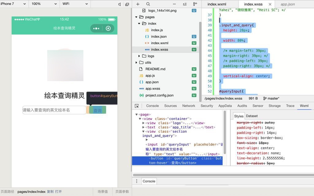
但是按钮的字体 和input的字体 都不是居中,再去调整看看
小程序 button 垂直居中
【总结】
目前用:
.input_and_query{
  height: 28px;

  width: 80%;

  /* width: 100%; */
  /* margin-left: 39px;
  margin-right: 39px; */
  /* padding-left: 39px;
  padding-right: 39px; */

  vertical-align: center;
}

#queryInput{
  font-size: 13px;
  border-radius: 16px;
  /* height: 28px; */

  border: 1px solid #ced4da;

  float:left;
  width:75%;

  display: flex;
  align-items: center;
  justify-content: center;
}

#queryButton{
  margin-left: 5px;

  background-color: #61D2B3;

  font-size: 15px;
  border-radius: 16px;
  height: 28px;

  float:left;
  width:20%;

  display: flex;
  align-items: center;
  justify-content: center;
}
效果:
先凑合这没用吧。
虽然部分细节有出入,但是基本上没大问题。
如果需要,后续再优化细节。
【后记】
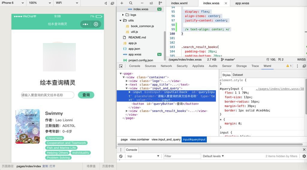
在后来基本上了解了flex布局后,再继续去优化输入框和按钮的布局:
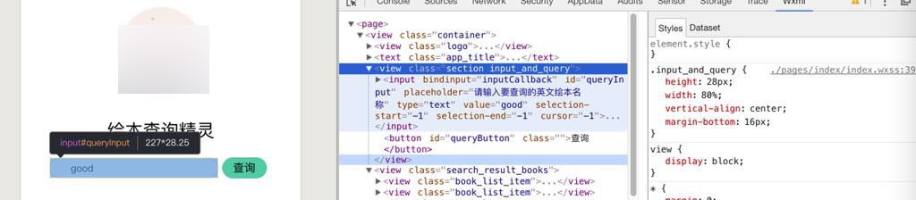
希望能尽量和之前保持一致:
然后:
【已解决】小程序中view的宽度没有撑满屏幕宽度
再去优化内部布局:
结果调试半天还是有问题
去看:
还是不行。
抽空继续优化布局。
目前发现用flex的值指定宽度,基本可用:
.input_and_query{
height: 28px;
vertical-align: center;
margin-bottom: 44px;
width: 100%;
display: flex;
}
#queryInput{
font-size: 13px;
border-radius: 16px;
margin-left: 39px;
border: 1px solid #ced4da;
/* flex:0 0 80%; */
/* flex-grow: 4; */
flex: 1 1 70%;
}
#queryButton{
margin-left: 15px;
margin-right: 39px;
background-color: rgba(97, 210, 179, 0.8);
font-size: 15px;
border-radius: 16px;
height: 28px;
/* flex-grow: 1; */
flex: 1 1 20%;
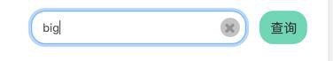
}基本上达到了想要的布局:
对于和之前有些出入,等抽空再去优化吧。
转载请注明:在路上 » 【已解决】小程序中画同一行内的输入框和按钮