折腾:
期间,需要去实现:
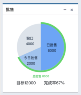
饼图
外层是圆环
内层是多块扇区
去参考:
http://gallery.echartsjs.com/editor.html?c=xSkv7HzPkZ
然后用代码:
<div class=”col-md-3″> <div class=”box box-primary”> <div class=”box-header with-border”> <h3 class=”box-title”>批售</h3> <div class=”box-tools pull-right”> <button type=”button” class=”btn btn-box-tool” data-widget=”collapse” data-toggle=”tooltip” title=”Collapse”> <i class=”fa fa-minus”></i></button> </div> </div> <div class=”box-body”> <div id=”echart_wholesales” style=”width: 225px; height:275px;” > </div> <div>月目标 12000 完成率 67%</div> </div> </div> </div> <script type=”text/javascript”> var convertionEcharts = echarts.init(document.getElementById(‘echart_wholesales’)); option = { title: { text: “”, subtext: “”, left: “center”, textStyle: { color: “#fff”, fontSize: 18 }, }, backgroundColor: ‘#ffffff’, tooltip: { trigger: ‘item’, formatter: “{a} <br/>{b}:({d}%)” }, series: [{ name: ‘事业线’, type: ‘pie’, radius: [‘0%’, ‘60%’], // color: [‘#ec5d51’, ‘#59abe1’, ‘#f4cf42’, ‘#3dc6a8’], color: [‘#5DADE2’, ‘#884EA0’, ‘#F5B041’, ], // color: [‘#FDFEFE’, ‘#28B463’], // color: [‘#a0dca0’, ‘#60bbb6’, ‘#f78db3’], label: { normal: { position: ‘inner’, formatter: ‘{b}\n{c}’ } }, data: [ { value: 6000, name: ‘已批售’ }, { value: 2000, name: ‘今日批售’ }, { value: 4000, name: ‘缺口’ }, ] }, { name: ‘分组’, type: ‘pie’, radius: [‘60%’, ‘70%’], labelLine : { normal : { length : 1, length2 : 1 } }, //color: [‘#a0dca0’, ‘#60bbb6’, ‘#f78db3’, ‘#feadac’, ‘#fae395′,’#91d4e5′,’#8eb3e8’], color: [‘#28B463’, ‘#FDFEFE’], label: { normal: { formatter: ‘{b}\n{c}’ } }, data: [ { value: 8000, name: ‘已完成’ }, { value: 4000, name: ‘缺口’ } ] }] }; convertionEcharts.setOption(option); </script> |
基本上实现了效果:
然后再去设置下面的文字的对齐。
【总结】
代码:
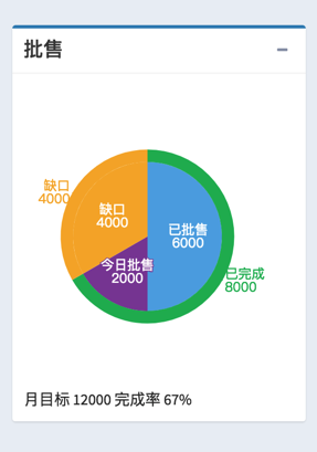
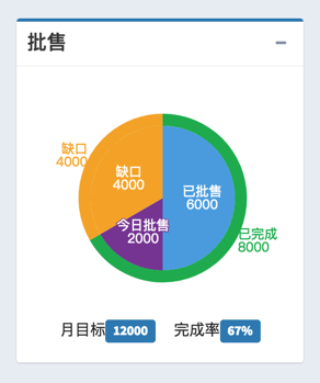
<div class=”col-md-3″> <div class=”box box-primary”> <div class=”box-header with-border”> <h3 class=”box-title”>批售</h3> <div class=”box-tools pull-right”> <button type=”button” class=”btn btn-box-tool” data-widget=”collapse” data-toggle=”tooltip” title=”Collapse”> <i class=”fa fa-minus”></i></button> </div> </div> <div class=”box-body”> <div id=”echart_wholesales” style=”height:220px;” ></div> <div style=”text-align:center;”> <p> 月目标<span class=”label label-primary”>12000</span> 完成率<span class=”label label-primary”>67%</span> </p> </div> </div> </div> </div> <script type=”text/javascript”> var wholesalesEcharts = echarts.init(document.getElementById(‘echart_wholesales’)); option = { title: { text: “”, subtext: “”, left: “center”, textStyle: { color: “#fff”, fontSize: 18 }, }, backgroundColor: ‘#ffffff’, tooltip: { trigger: ‘item’, formatter: “{a} <br/>{b}:({d}%)” }, series: [{ name: ‘批售详细数据’, type: ‘pie’, radius: [‘0%’, ‘60%’], // color: [‘#ec5d51’, ‘#59abe1’, ‘#f4cf42’, ‘#3dc6a8’], color: [‘#5DADE2’, ‘#884EA0’, ‘#F5B041’, ], // color: [‘#FDFEFE’, ‘#28B463’], // color: [‘#a0dca0’, ‘#60bbb6’, ‘#f78db3’], label: { normal: { position: ‘inner’, formatter: ‘{b}\n{c}’ } }, data: [ { value: 6000, name: ‘已批售’ }, { value: 2000, name: ‘今日批售’ }, { value: 4000, name: ‘缺口’ }, ] }, { name: ‘批售总体数据’, type: ‘pie’, radius: [‘60%’, ‘70%’], labelLine : { normal : { length : 1, length2 : 1 } }, //color: [‘#a0dca0’, ‘#60bbb6’, ‘#f78db3’, ‘#feadac’, ‘#fae395′,’#91d4e5′,’#8eb3e8’], color: [‘#28B463’, ‘#FDFEFE’], label: { normal: { formatter: ‘{b}\n{c}’ } }, data: [ { value: 8000, name: ‘已完成’ }, { value: 4000, name: ‘缺口’ } ] }] }; wholesalesEcharts.setOption(option); </script> |
效果:
转载请注明:在路上 » 【已解决】AdminLTE中添加外层圆环内层扇区的饼图